Seasonal diagrams are excellent to use when you want to assess phenomena over time. In Participatory Action Research this can be useful to explore e.g. what is the best time for an intervention. In this activity, participants explore the effects of the changing phenomenon on their lives with regard to health status, workload, food security, and other issues. This activity can also be useful for identifying patterns that relate to e.g. sexual and reproductive health. Participants may, for example, identify a specific season during which family members leave their homes for seasonal work in another location, and when they return (and therefore when patterns of sexual behavior may change). There may be a specific time where participants note an increase in the number of births, STIs or abortions. For programs that are planning to implement interventions related to livelihood, nutrition, or maternal or child health, it’s good to know about harvest cycles and times when people may be particularly hungry or busy, or when they have more disposable income.
This method allows you to identify serious problems -and its prevalence throughout a certain period- that can be addressed through appropriate interventions, and collect field information on e.g. the best time of year to implement certain projects. This is a fairly non-threatening exercise and can also be useful as a starting exercise to get to know the community and its major issues.
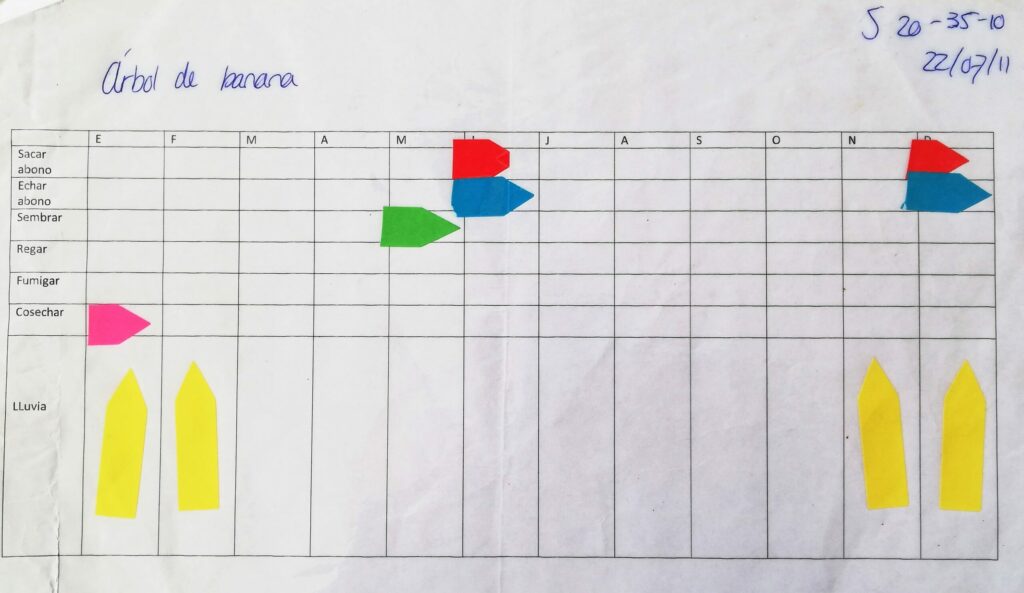
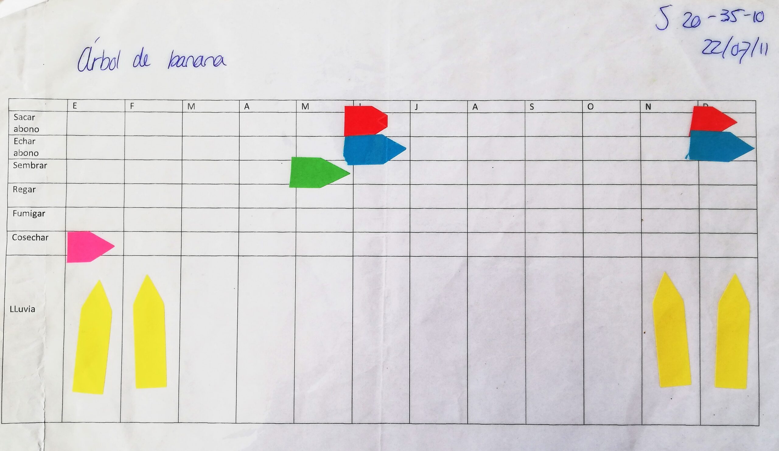
Basically, you ask your participant to fill in a scheme in which you have put a timeline horizontally and different phenomena or activities vertically. This method is often used in social-ecological systems where people interact with their proximate natural environment. For example, in my research on ecological sanitation in Bolivia I used it to assess when people take each step in the process of harvesting crops -in which month do they take out the fertilizer from their latrine, when do they put it on their land or kitchen garden, when do they harvest, when is the rainy season et cetera. In an action research on Saba I used it to assess how much redfish and lobster the fishermen fish each month.
Seasonal diagrams can also be used to assess what activities people perform on a daily or weekly basis. You can predefine a set of activities or let people fill in activities themselves. Participants will then be able to identify patterns in their daily lives that are a result of the changing seasons. Seasonal diagrams can be performed with participants individually or with multiple participants in for example focus groups.
- When there is uncertainty or a lack of knowledge about how a phenomenon changes over time
- When you want to compare views on changing phenomena among respondents
Seasonal Diagrams can be used individually or with more respondents simultaneously. Let’s consider you want to verify with your participants -in a focus group setting- what common diseases and health issues occur in their community and how it’s prevalence changes throughout the year. What you need for the seasonal diagram exercise is flipchart paper, markers; or alternatively, bare ground, a stick, and many small stones, dry beans or other small objects. The ideal workspace is large enough for participants to see and add to the seasonal diagram. The ideal number of participants is at most ten people.
STEP 1
If participants are not already acquainted, ask them to introduce themselves.
Describe the activity, its purpose, and how it will work. Remind participants that this is a group learning exercise and that it is not necessary for everyone to agree on everything. However, everyone in the group deserves respect. Participants should refrain from judging, interrupting or ridiculing others, and should respect the privacy of others by maintaining confidentiality. Distribute markers and paper to each participant. If you feel your participants cannot live up to this, you may want to choose to perform seasonal diagrams with the participants individually.
STEP 2
Gather the group together around a large piece of paper on the ground or around a clear space on the bare earth. Ask the group to list all the types of health issues they see as highly prevalent and/or threatening in their community. Draw a grid on the ground or on the paper. The grid will have 12 columns representing the 12 months of the year, and rows for each issue that will be examined; the number of rows you include on the grid, will depend on the number of issues you’re examining. If the group is more familiar with seasons rather than months of the year, use local seasonal descriptions instead of months. Ask the group which seasons or months correspond to which health issues. Ask the participants to identify the months (or seasons) during the year when the health issue(s) is/are most prevalent. Depending on how prevalent the issue(s) is/are during a given month, participants will rate the issue on for example a scale of 1 to 10 (0 or blank indicating ‘no prevalence’ during a certain month, 1 indicating ‘very low prevalence,’ and 10 indicating ‘very high prevalence’). If people are non-literate, one variation is to ask participants to place stones (or beans, or other small objects) in the cells instead of rankings; when the problem is more prevalent, more stones should be added. You will be able to tell when problems are most prevalent by the number of stones in a given cell. Allow plenty of time for participants to discuss their answers among themselves. Listen for points of disagreement among participants, and note the themes that emerge.
STEP 3
Facilitate a discussion with the group. You can use the following questions to guide you:
- Were you, as a group, able to easily agree on the seasons of low and high prevalence? If not, what was the source of disagreement? What patterns do you see in your seasonal calendar?
- What can you see as the possible reasons for the high prevalence of [health issue] during [month or season]? Now that we have identified season as a factor, what could we do to improve the situation?
- Do you see any differences in the way the problem(s) affects women and men differently during certain seasons? How can you explain this difference?
- What can you do as an individual to address these problems? What can other community members do to address these problems?
When performing seasonal diagrams individually, during analysis you can then compare the different seasonal diagrams and check whether there are trends over time or differences and similarities between your participants. This analysis process can be done together with your participants in, for example, a focus group setting, so you give your participants the opportunity to draw their own conclusions. Whether you perform seasonal diagrams individually or in group settings, for both counts, that this can be very helpful for participants to see when certain phenomena happen most or least often and prioritize or plan new activities accordingly.